🌝 Pratik Joshi
Mumbai, India

Simplified the loan journey for borrowers and helped the business reduce churn.
Client
CredAble
What we delivered
Enhanced UX & UI Design
Optimised User Flow
Responsive & White-Label Ready UI
Usability Enhancements
My Role
Wire-framing
Screen Flows
Visual Design
Interaction Design
Creative team
Pratik Joshi
Platform
Desktop platform
Mobile platform
PROBLEM
CredAble's Borrower Onboarding Module was complicated and had many UX flaws. Confusing design made the process difficult for both borrowers and businesses.
GOAL
My goal was to redesign the Borrower Onboarding process to make it faster, simpler, and easier for borrowers to sign up and submit their details—
Helping the business increase conversions, speed up approvals.
RESEARCH
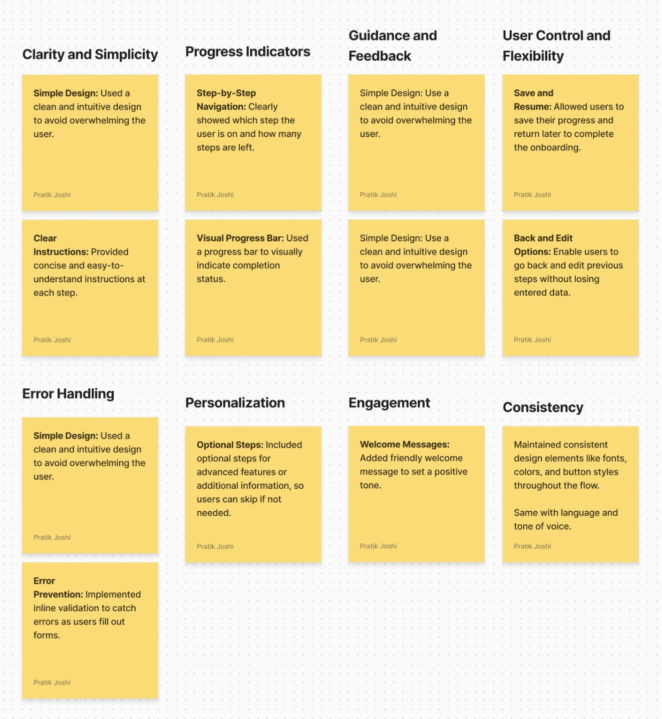
Based on some users feedback and heuristic evaluation of the onboarding journey, I’ve identified key issues that increase cognitive load, which was impacting the business over time.
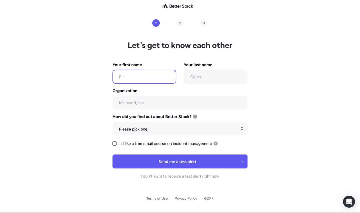
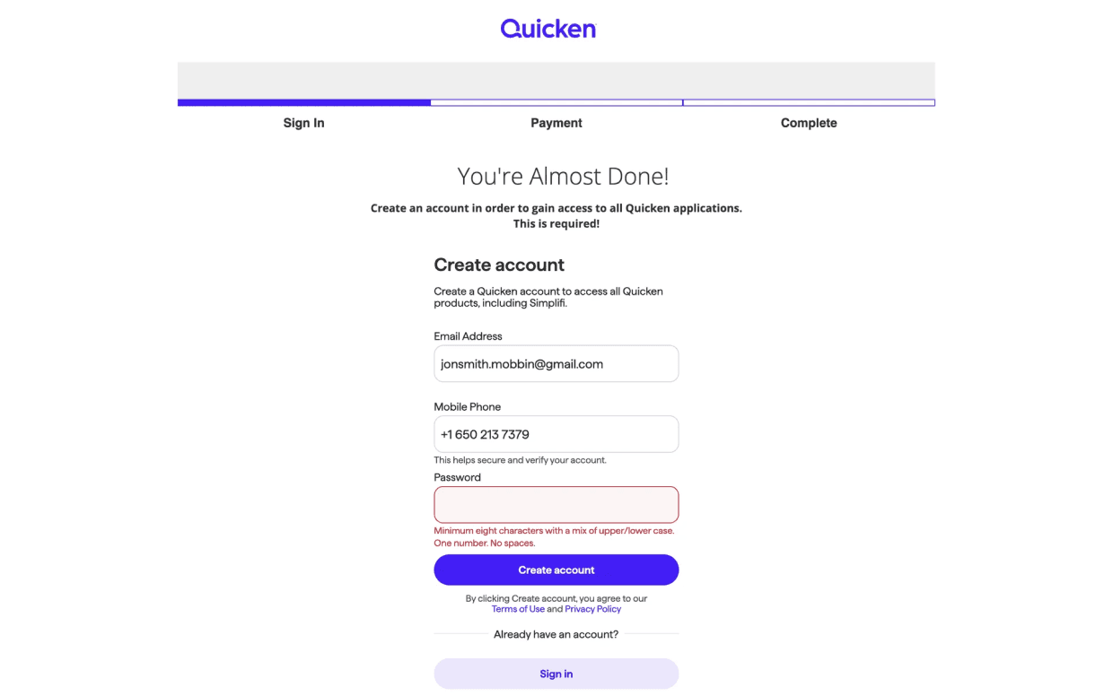
To improve design I also have done research on competitors onboarding flow and other industries onboarding layout.


Design Improvements
Layout
I come up with two types of layout options:
Option A: One with centre-aligned content
Option B: One with right-aligned content with left-side illustrations
After discussing with the team, we decided to go with the center-aligned content layout. There were two main reasons for this:
1. Easier to adapt for different brands
Different brands use different visuals—some like illustrations, others use photos. If we use side-by-side layouts, we’ll need to adjust each time. Center-aligning content is easier and works better with any style.
2. Works better with future AI chatbot integration
We’re planning to add an AI chatbot later to help users and reduce the workload for Relationship Managers. Center-aligned content gives us a balanced layout that works well with chatbot features and doesn’t feel cluttered.
Option A

Option B
Stepper Improvement
Each step originally had a title, a subtext, and additional explanatory text on each step’s page.
To simplify and reduce repetition, I removed the subtext from the step overview. Now, each step only includes a clear title, and the full explanation is shown on the actual step page.
Old
Each step originally had a title, a subtext, and additional explanatory text on the step’s page.

Improved
To simplify and reduce repetition, I improved main stepper content and removed the subtext from the step overview

This makes the steps easier to scan and avoids repeating the same message in multiple places. It also follows good UX principles like:
Clarity and simplicity – only showing what’s needed at the right time
Progressive disclosure – giving users more detail when they need it, without cluttering the main flow
Multi Language Selection
Improved multi language selection section
Old
The older design showed the wrong selected language via UI and didn’t account for displaying multiple language options clearly.

Improved
To improve the experience, I added a dropdown for language selection where the chosen language is clearly shown.
Each supported language is displayed in its native script to improve clarity and support inclusive design.

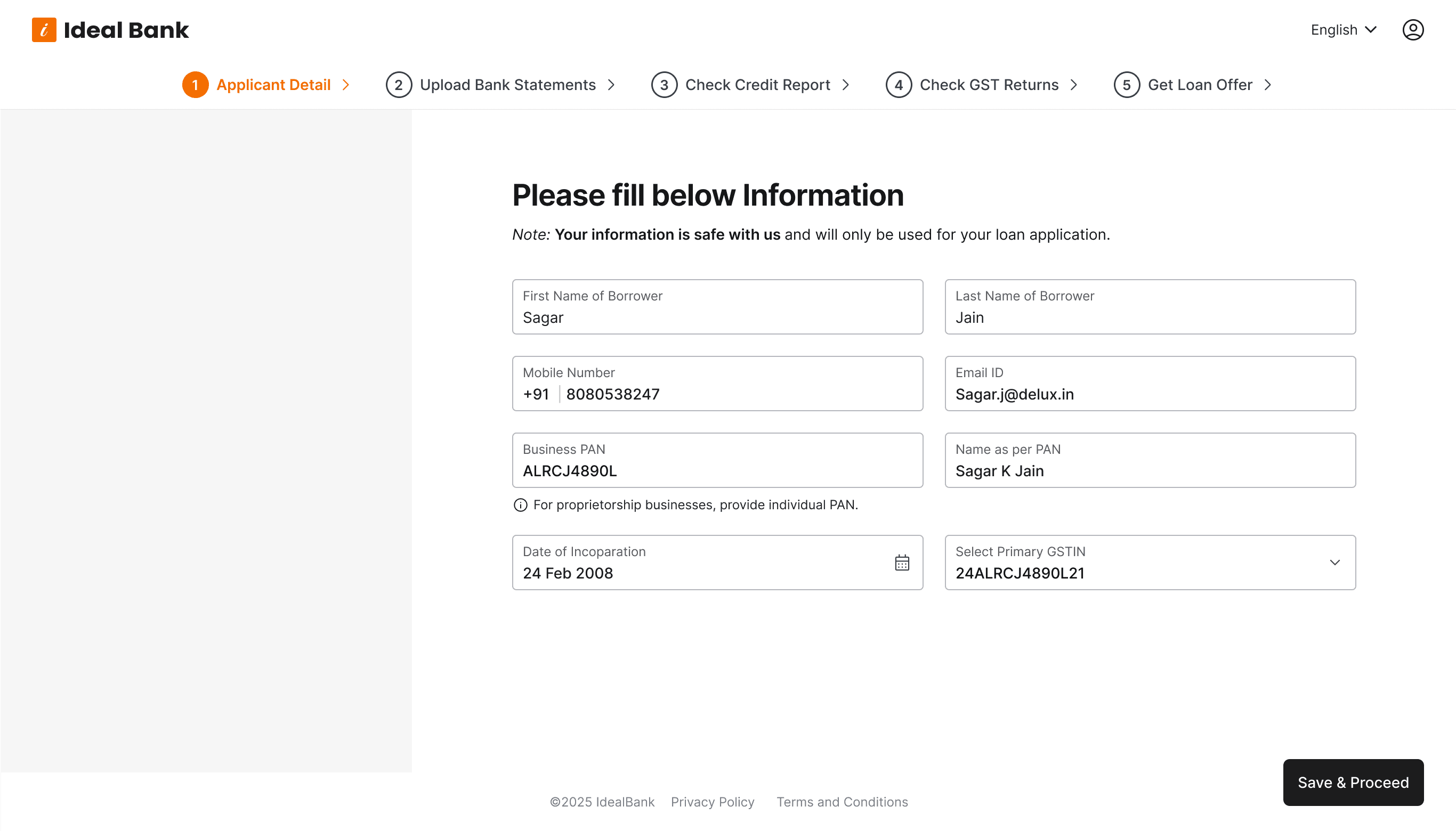
Improving Guidance for GST Verification
This is an important section where users need clear guidance to complete a required task.
To check GST returns (as per Indian Government regulations), users must:
Sign in to the GST portal
Grant API access permissions
Return to our onboarding form and log in to the government portal to give access.
for what we only provided text instructions, which can led to confusion and drop-offs.
The previous design relied only on text instructions and lacked visual cues.
Old
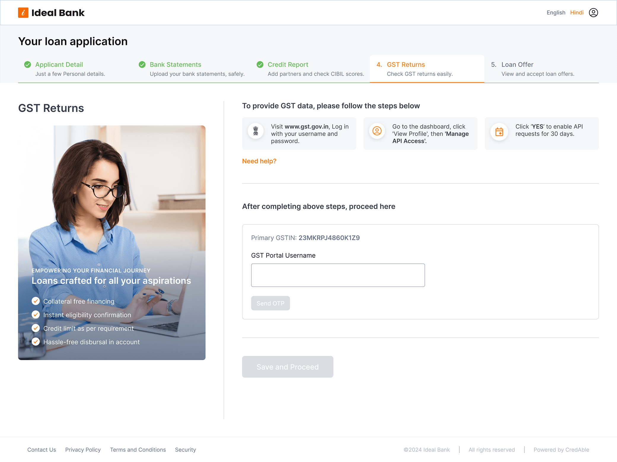
To improve the experience, I added:
A step-by-step guided flow with clear instructions
Visual previews of the actual government web pages, so users know what action has to be done.
A button that opens the government portal in a new tab, helping users quickly complete the action without losing their place.
These changes follow key UX principles like:
Guidance and feedback – giving users help when they need it
Minimizing cognitive load – breaking down a complex task into simple steps
Consistency and predictability – helping users feel confident about what to do next
Improved version

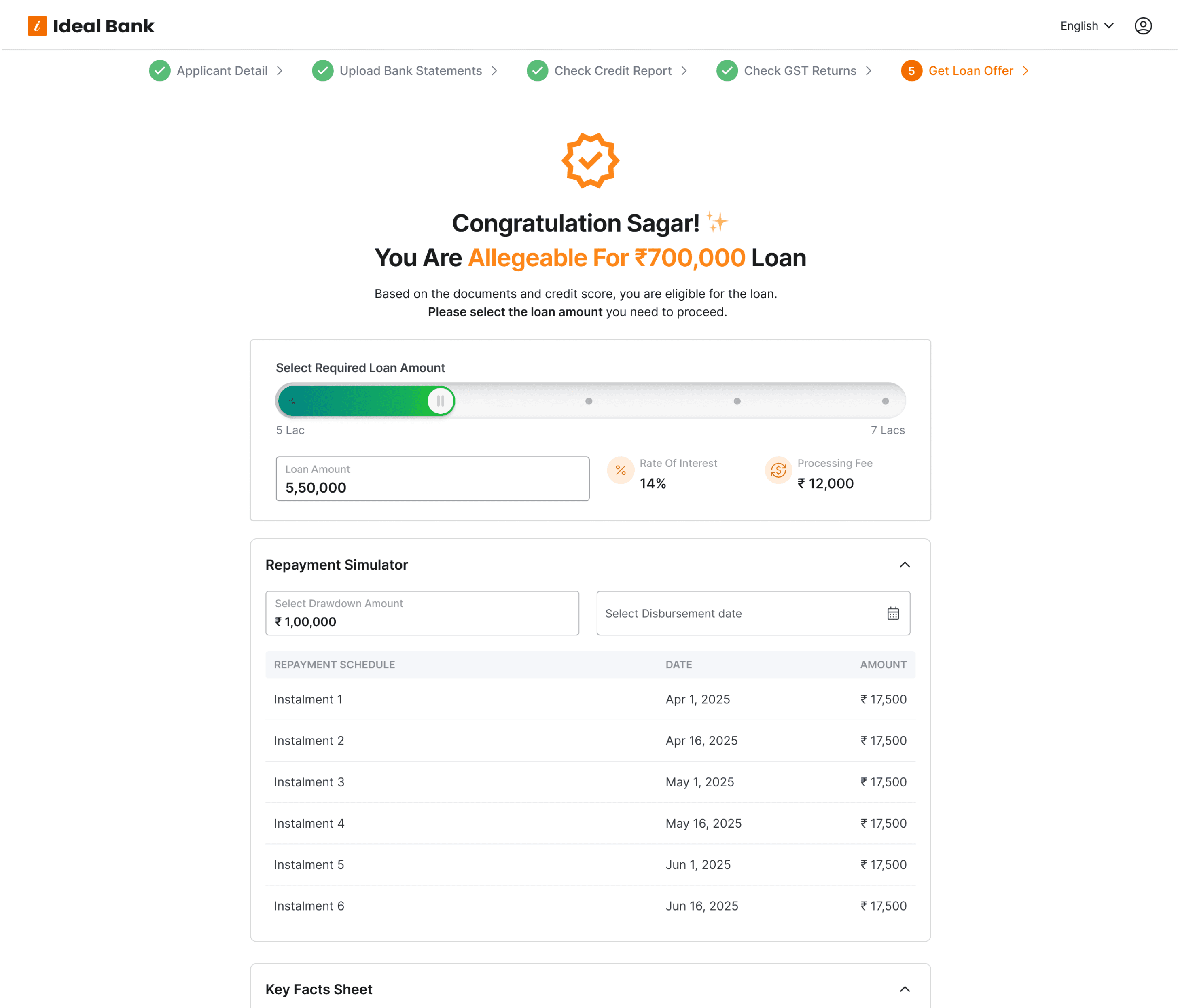
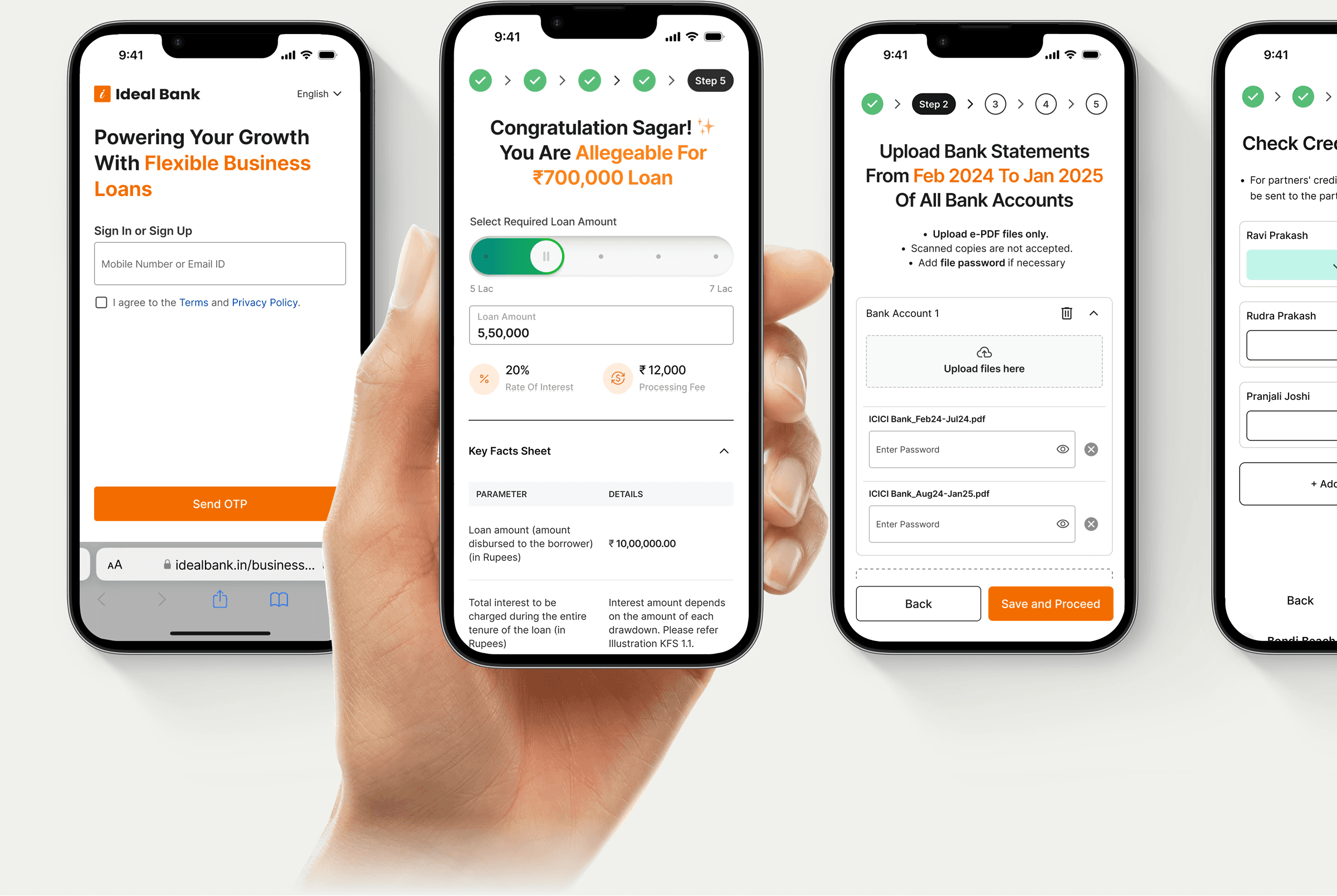
Loan Offer Section
The older Version
The loan offer section felt a bit dull. The Key Fact Sheet and Repayment Calculator were hidden behind tabs that opened as pop-ups, which wasn’t very user-friendly.
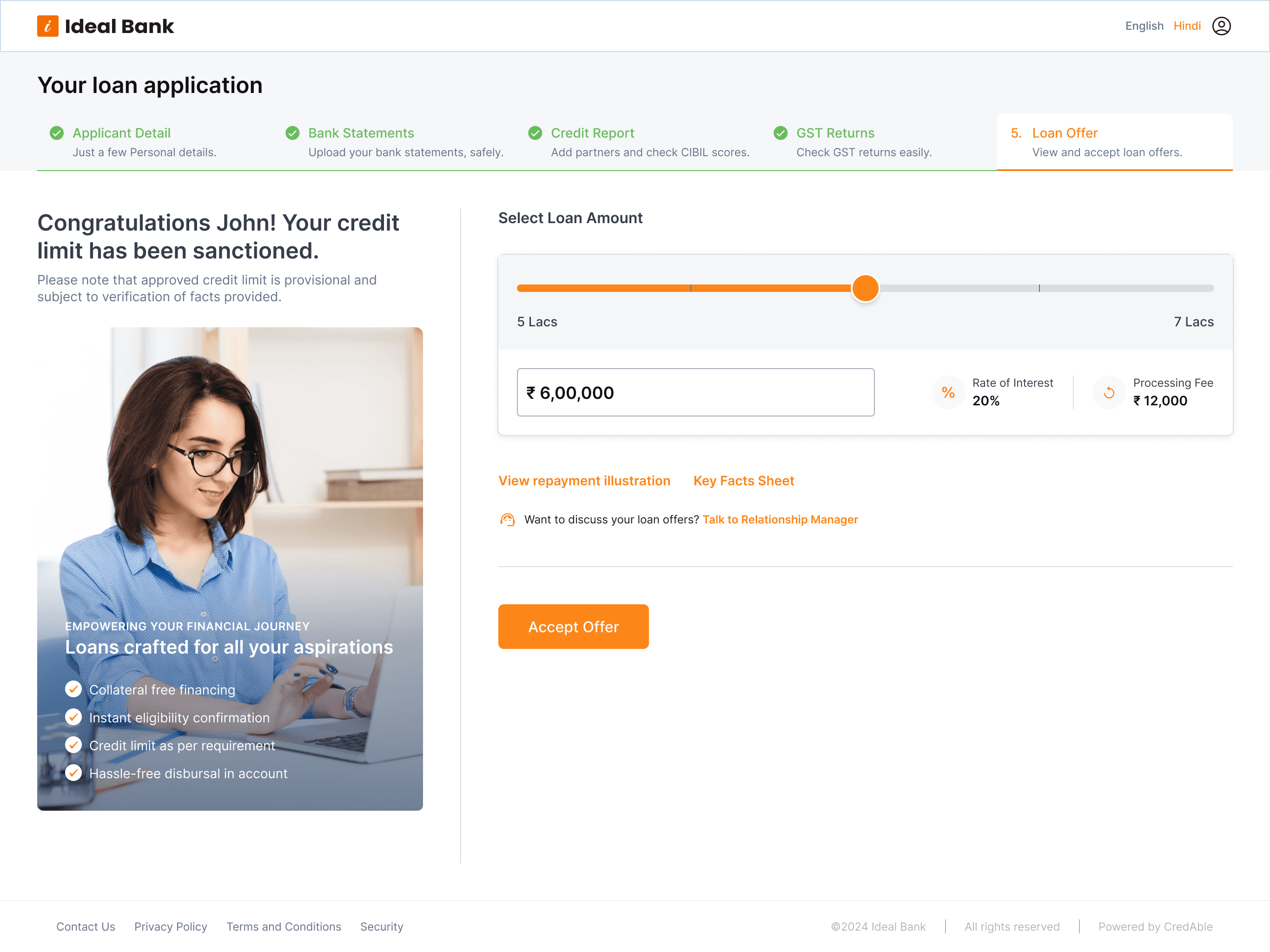
To improve the experience:
I replaced the pop-ups with expandable panels that are always visible on the page. This makes important information easier to find and access without extra clicks.
I enhanced the amount selection bar by improving the UI and adding micro animations to make the interaction feel smoother and more engaging.
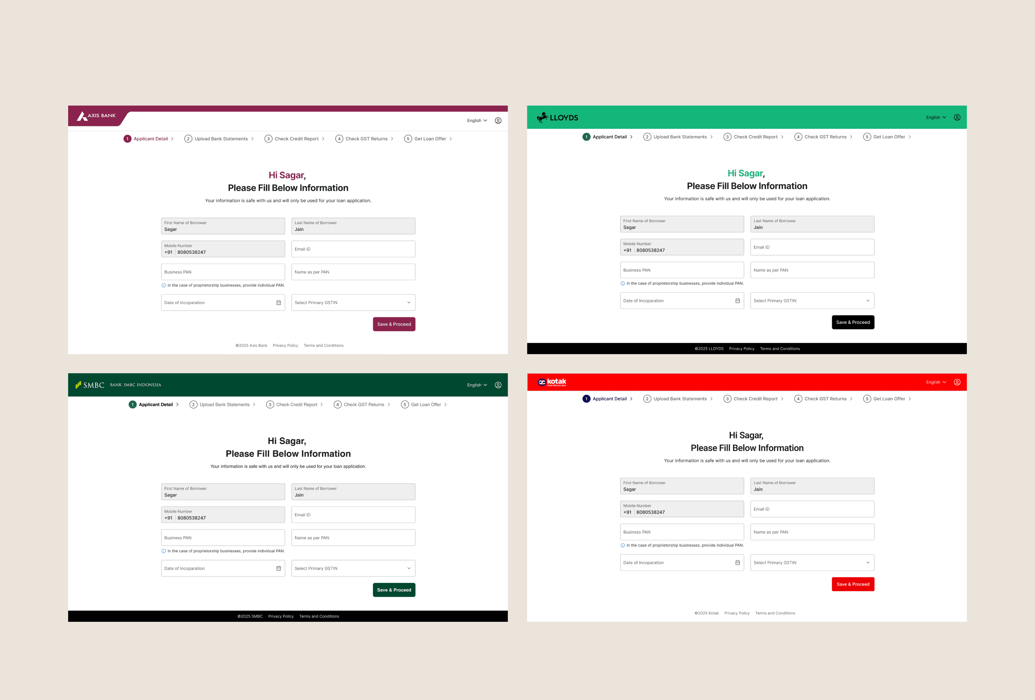
White-Label Preview Across Various Brands
WAP - MOBILE DESIGN
While making these updates, I made sure the layout works well on all devices.
I designed the mobile version from scratch to make it fully responsive and easy to use.
Conclusion
This project was all about turning a confusing onboarding flow into something simple, clear, and easy to use.
By reducing cognitive load and adding better guidance, I helped borrowers move through the process faster and with less frustration.
It also helped the business by cutting drop-offs and making approvals more efficienz
Other Projects
SaaS / Web Project
Scaled a Loan Origination Platform from Zero—Reduced Processing Time & Increased Conversions
View Now
Mobile App
ToVictory
A Strategic
board game app
View Now
© 2025 Designed by Pratik Joshi
pratiksdesign@gmail.com