


Business Loan:
Borrower Onboarding
Background
At CredAble, our mission is to empower businesses by providing seamless access to financial resources. When I was tasked with revamping the business loan onboarding process, I saw an opportunity to create a user-friendly experience that would reduce churn and minimize cognitive load for our borrowers. Here’s how I approached this challenge and the impact it had.
Client
CredAble
Role
Ideation, Design Lead
Team Size
1 Product Manager, 7 Developers
2 UX Designers including myself
Timeline
3 months

Problem
“The process can be long and time-consuming to fill out all the online applications.”
“Once I apply, I never know how long it will take to hear back from the lender.”
“Some online lenders seem sketchy, and I'm not sure if my information is secure."
“I miss the personal touch of talking to a loan officer and explaining my business needs directly.”
Our previous onboarding process was complex and time-consuming, leading to high dropout rates (churn) and frustrated users. Borrowers had to navigate through multiple forms and provide extensive documentation, often without clear guidance. My goal was to simplify this process, making it intuitive and efficient, thereby improving user satisfaction and completion rates.
Challange
Our onboarding process was causing frustration among borrowers. The poor UI, lack of guidance, and mediocre navigation led to a high churn rate. My goal was to address these pain points, making the process user-friendly and efficient.
Research & Insights
I began by conducting user interviews and analyzing feedback. Key pain points emerged:
Poor UI: The interface was cluttered and not intuitive, making it difficult for users to complete the process.
Lack of Guidance: Users were unsure about the steps and requirements, often feeling lost.
Okay Navigation: While the navigation was passable, it lacked clarity and efficiency.
Design Principles
I tried to established the following design principles:
Improve UI: Create a clean, intuitive interface.
Provide Clear Guidance: Use tooltips, progress indicators, and contextual help.
Enhance Navigation: Ensure the process is linear and easy to follow.
Solutions
1. Improved UI
I redesigned the interface to be clean and user-friendly. By decluttering the layout and using a consistent design language, I made the process visually appealing and intuitive. This followed the aesthetic-usability effect, where a pleasant design improves user satisfaction and performance.
2. Clear Guidance
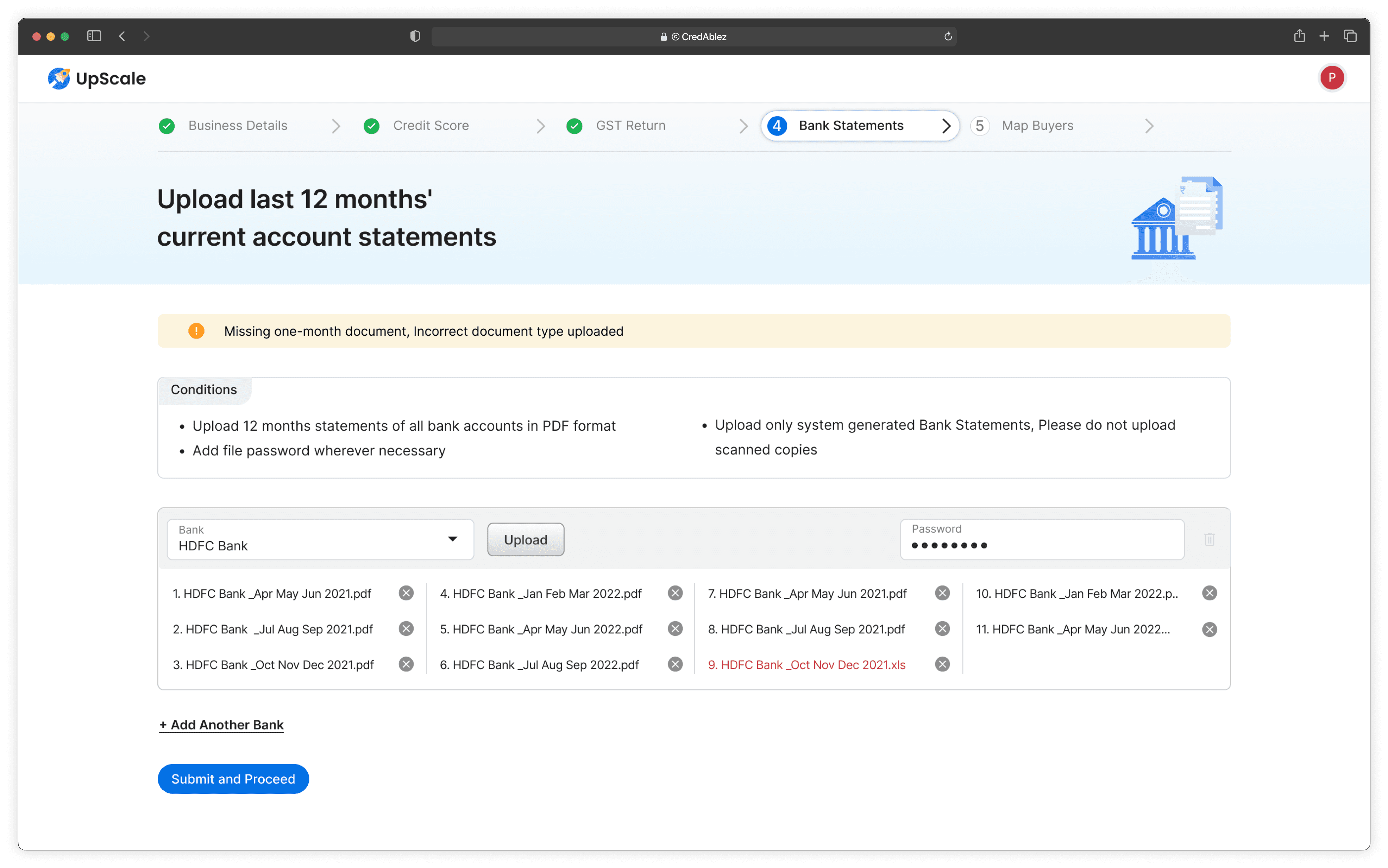
To address the lack of guidance, I integrated tooltips, FAQs, and visual cues throughout the onboarding process. For example, when users needed to upload documents, a tooltip provided examples of acceptable formats. A progress bar showed how many steps were completed and how many remained, giving users a clear sense of direction.
3. Enhanced Navigation
I transformed the navigation into a simple, linear process with clear milestones. Each step focused on a single task, reducing cognitive load and preventing users from feeling overwhelmed. This approach aligns with Hick’s Law, which states that decision time increases with the number and complexity of choices.

Result
I collaborated with our design and development teams to bring these changes to life, using wireframes and prototypes to test with actual users and iterating based on their feedback. The result was a 20% reduction in onboarding time and a significant drop in churn rates.
Desktop designs
I collaborated with our design and development teams to bring these changes to life, using wireframes and prototypes to test with actual users and iterating based on their feedback. The result was a 30% reduction in onboarding time and a significant drop in churn rates.
Mobile screens
I collaborated with our design and development teams to bring these changes to life, using wireframes and prototypes to test with actual users and iterating based on their feedback. The result was a 30% reduction in onboarding time and a significant drop in churn rates.