Borrower Onboarding
Simplified the loan journey for borrowers and helped the business reduce churn.
Client:
CredAble
Industry:
Fintech, B2B
Deliverables:
UX & Strategy, Visual Design
Context:
2024, Lead UX
Foundation
CredAble's Borrower Onboarding Module was complicated and had many UX flaws. Confusing design made the process difficult for both borrowers and businesses.
My goal was to redesign the Borrower Onboarding process to make it faster, simpler, and easier for borrowers to sign up and submit their details—
Helping the business increase conversions, speed up approvals.

Design Improvements
Layout
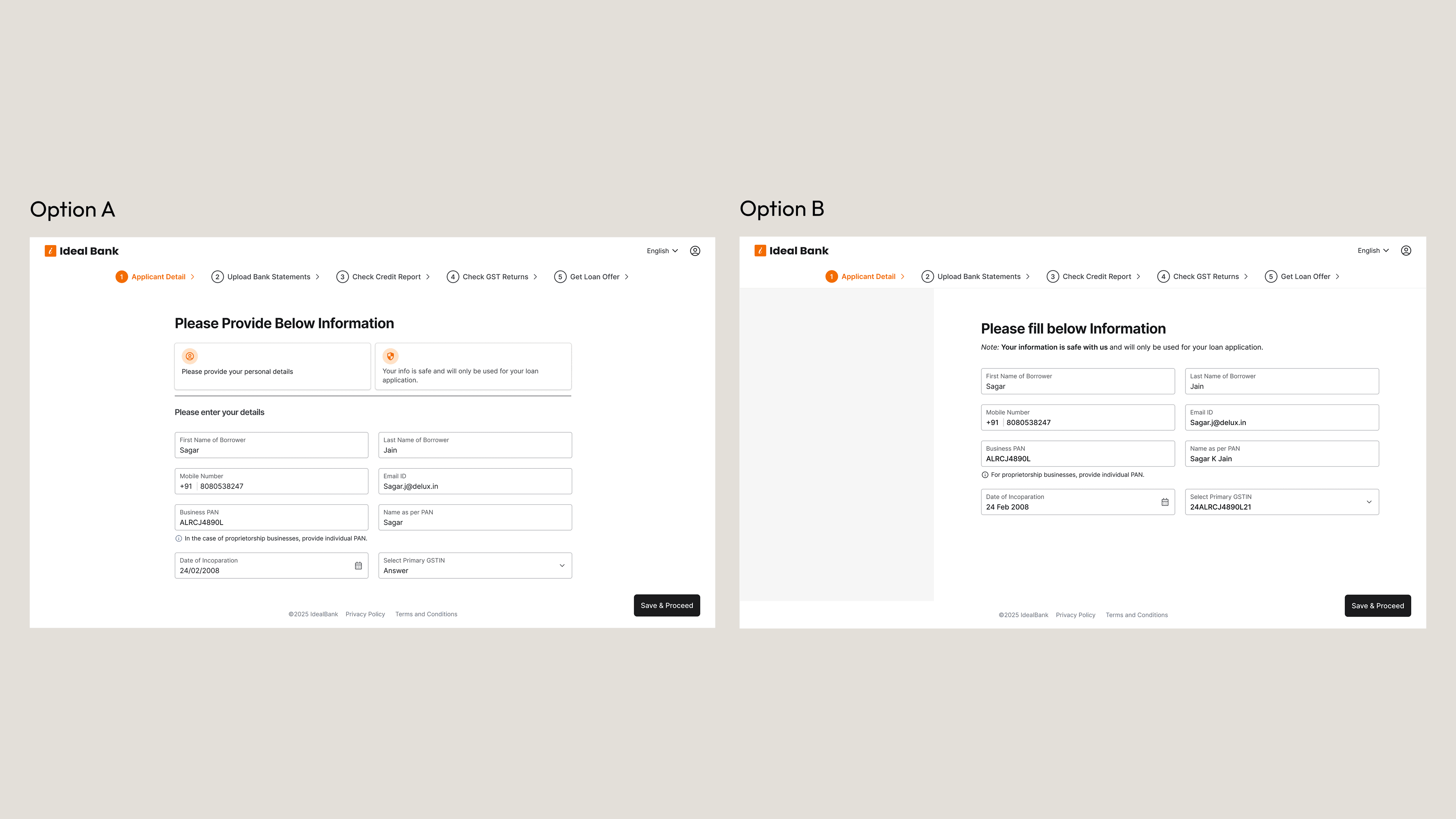
I come up with two types of layout options:
Option A: One with centre-aligned contentOption
B: One with right-aligned content with left-side illustrations After discussing with the team, we decided to go with the center-aligned content layout.
There were two main reasons for this:
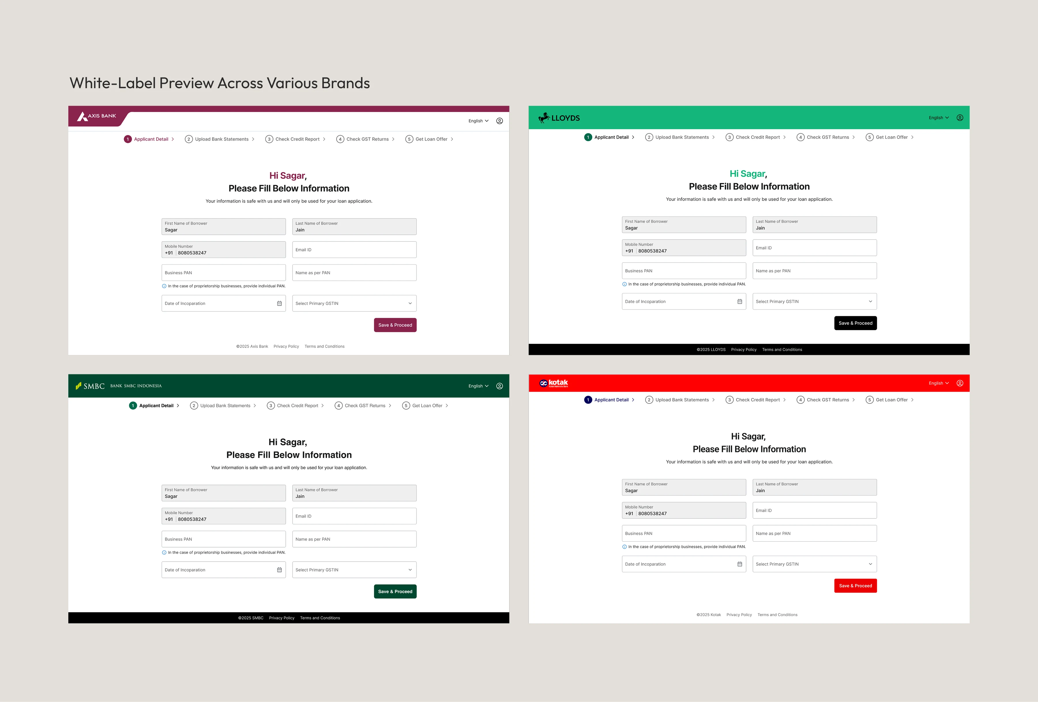
1. Easier to adapt for different brands Different brands use different visuals—some like illustrations, others use photos. If we use side-by-side layouts, we’ll need to adjust each time. Center-aligning content is easier and works better with any style.
2. Works better with future AI chatbot integration We’re planning to add an AI chatbot later to help users and reduce the workload for Relationship Managers. Center-aligned content gives us a balanced layout that works well with chatbot features and doesn’t feel cluttered.
Design Improvements
Layout
I come up with two types of layout options:
Option A: One with centre-aligned contentOption
B: One with right-aligned content with left-side illustrations After discussing with the team, we decided to go with the center-aligned content layout.
There were two main reasons for this:
1. Easier to adapt for different brands Different brands use different visuals—some like illustrations, others use photos. If we use side-by-side layouts, we’ll need to adjust each time. Center-aligning content is easier and works better with any style.
2. Works better with future AI chatbot integration We’re planning to add an AI chatbot later to help users and reduce the workload for Relationship Managers. Center-aligned content gives us a balanced layout that works well with chatbot features and doesn’t feel cluttered.


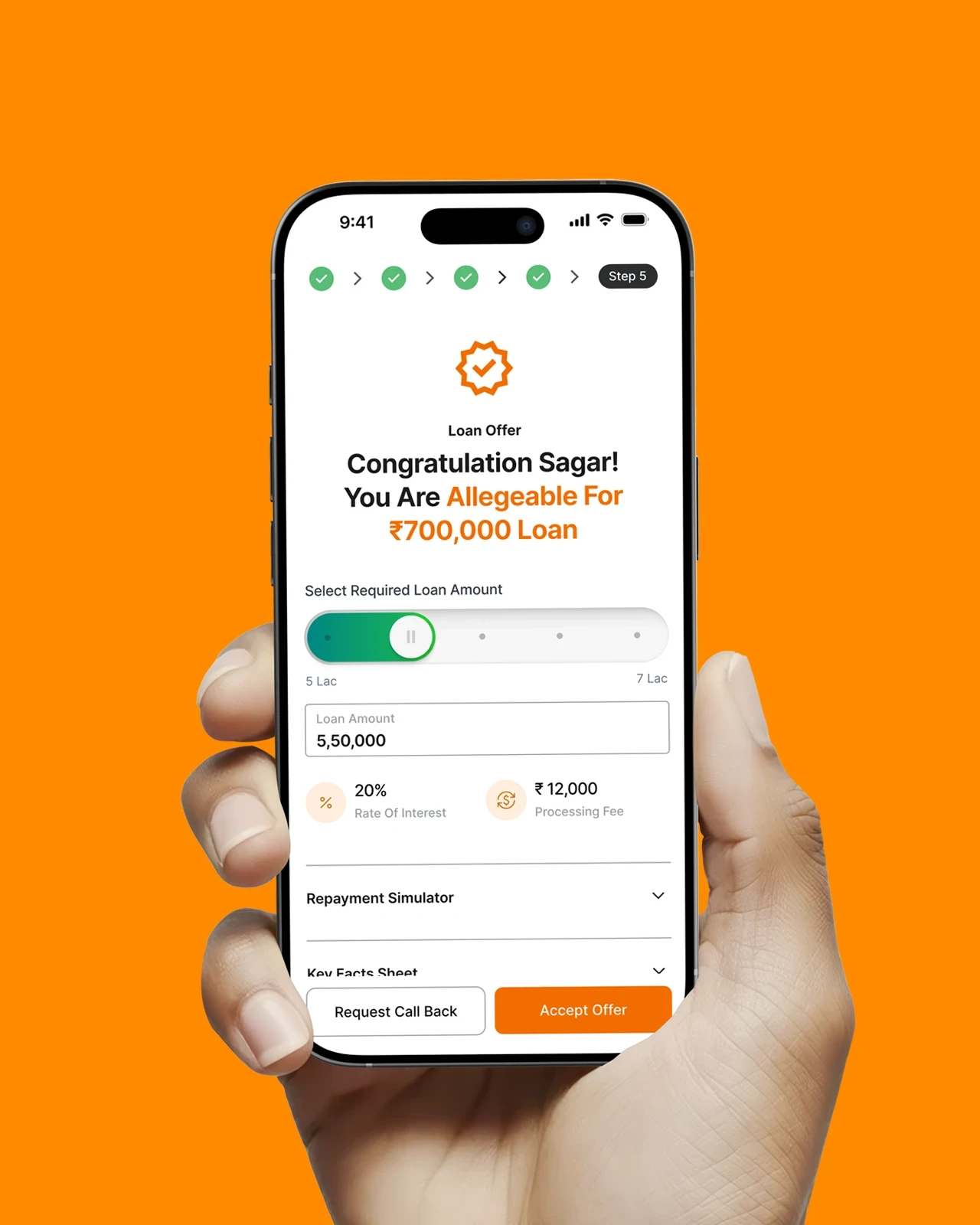
Outcome
This project was all about turning a confusing onboarding flow into something simple, clear, and easy to use.
By reducing cognitive load and adding better guidance, I helped borrowers move through the process faster and with less frustration. It also helped the business by cutting drop-offs and making approvals more efficient.
Other Cases
Other Cases
Other Cases


